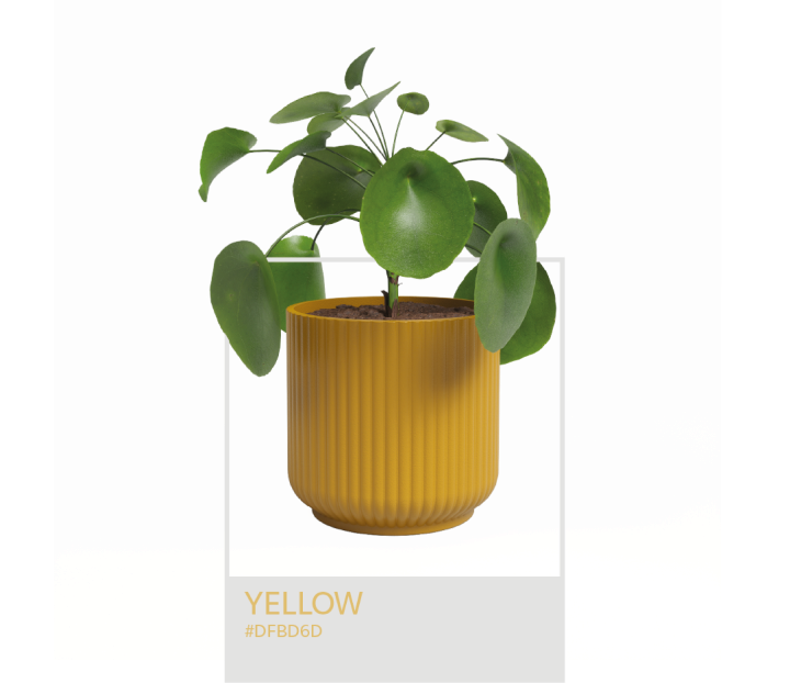
Yellow is synonymous with creativity, joviality and joy, transmitting lightness, relaxation and optimism through its light shade.

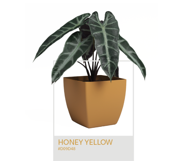
Honey yellow is inspired by the shade of amber and bees, offering an energic and dynamic glow to every decorative context.


Our plastic and ceramic collections are richer with a bet on different shades of green for 2024!
This calm, harmonious and balanced colour represents, above all, the energies of life, nature, hope and
perseverance.
Ash green continues to strengthen its position, not only in our market but also in
various matt or shiny
products (examples from the automotive or technological sectors), noting an emerging influence of darker
shades of green. With a deep, telluric and natural appeal, this shade is inspired by aromatic herbs, greyish
leaves and their umbilical relationship with nature, representing wisdom, intelligence and freshness.
Green means hope, freedom, health and vitality, symbolising nature, money and
youth. It is associated with
growth, renewal and living nature.


Slate blue is a trend and also enters the range of new colours in the plastic
collection! It is a calm and soothing colour, associated with stability, loyalty, intelligence, imagination,
freedom and inspiration, reminiscent of open spaces and the ocean.
The name of the colour slate comes from a rock commonly used in construction. The natural shades of slate
differ, ranging from solid grey to blue, green, dark red, black and even violet. The most common, however,
is a medium-dark grey with blue tints, from which our slate blue takes its inspiration. Transparent and
earthy, slate blue is an option that blends well with almost any colour due to its neutral quality. When
mixed with other neutral colours, such as beige and bronze, or bright colours, such as yellow, it creates a
more modern colour palette.

In line with the new approach to pastel shades that have been seen, especially in certain products and interiors, we aim to add a touch of serenity, sophistication and serenity to our pots.
Lavender is the name of a colour and a versatile medicinal plant used to cure several health problems. This new colour is therefore inspired by the purity, devotion, grace and calm transmitted by lavender, adding a touch of warmth and a sense of optimism and cheer to any decorative context.
